
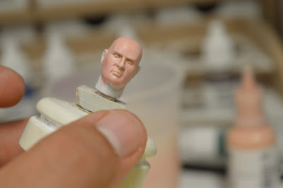
Not being put off by the look on the faces (sorry could not help it) this last week I have been focusing more on them and trying to make it all work together as my first attempts were interesting.
So keeping with what I had already done on the idea of where the highlights and shadows went I was working more on a better color palette
This time round I was working with a more muted Skin tone by adding a yellow/green to the flesh tone and adding a white/blue to the highlights and then adding a final glaze of red Ink.
Here are my results
These, I feel came out a lot better, but who am I to judge what do you all think?


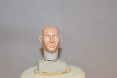


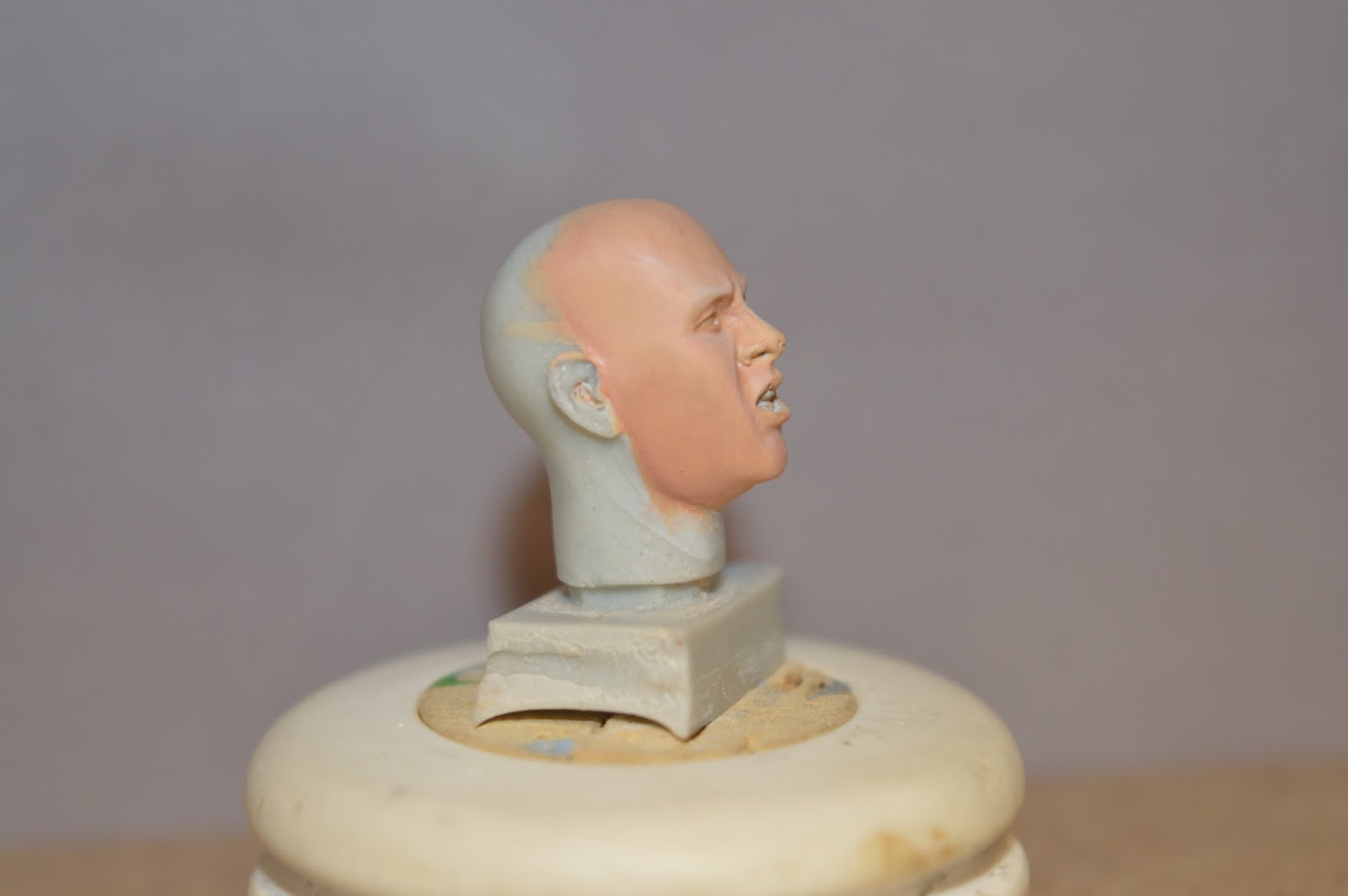


It's not going to get me anything other than its a face buts for only two weeks from first to this I think it is a great triumph.
They are nice and subtle, but I think at this scale you could push the contrast more as that subtlety will be lost on a miniature with loads of other detail :) It will also help to define the features more. Though what you have done here would be VERY nice on a feminine face where you don't want too much contrast which makes them seem more manish.
ReplyDeleteI'm horrible with painting faces. I do think it's a bit pink here though. Maybe work in some browns?
ReplyDelete